
Allergan Aesthetics
ODK media
LegalZoom
Belkin / Linksys
Epson
Gulfstream
Contact
Mo' case studies
Not everything that matters in a system can be tracked. This is how I learned to design for clarity, not just consistency.
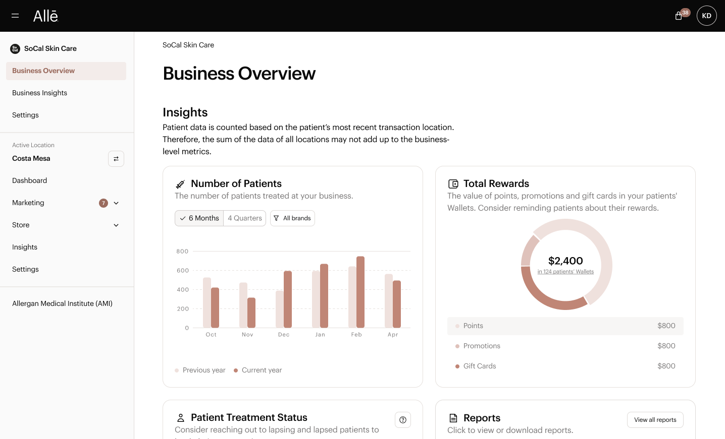
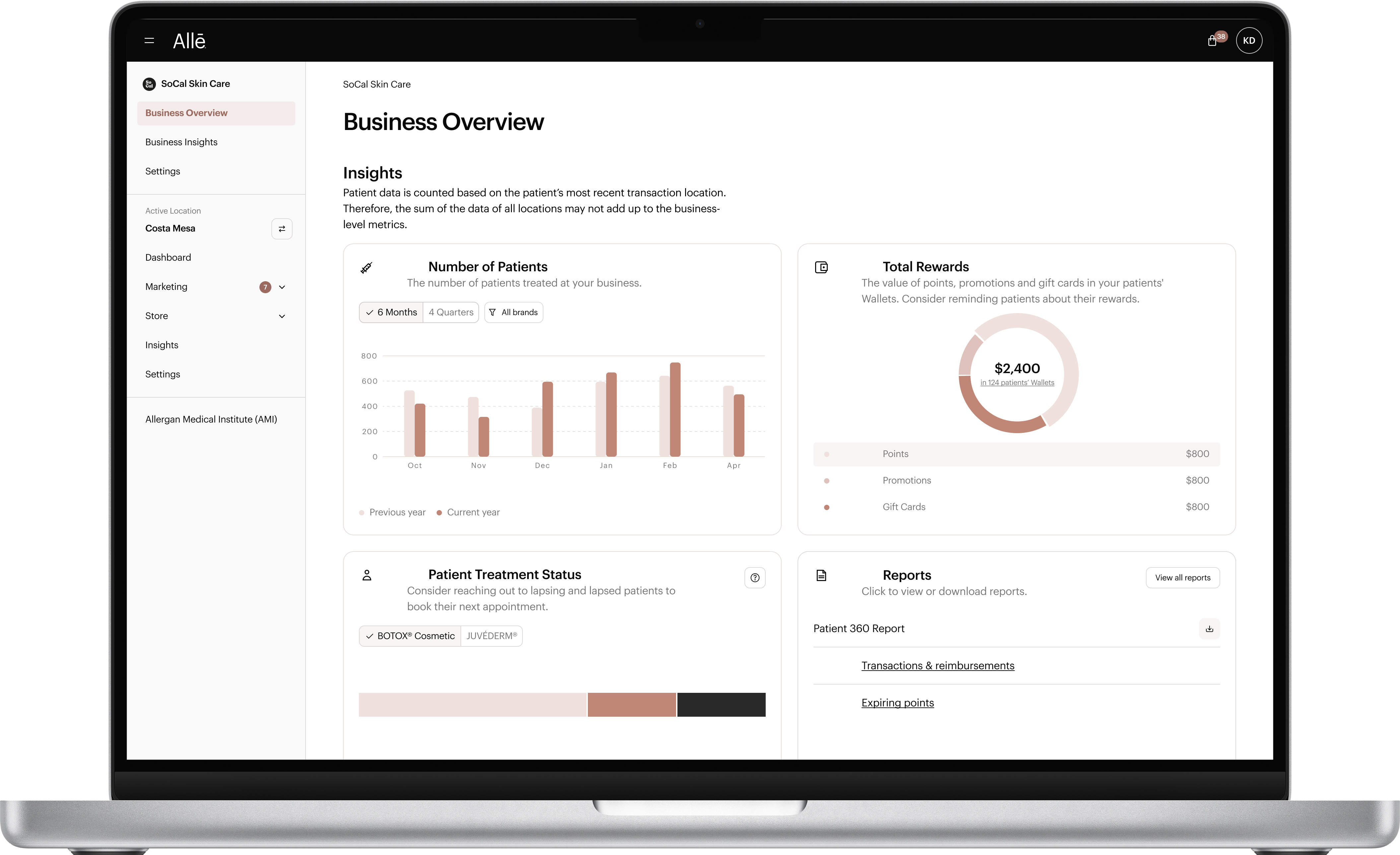
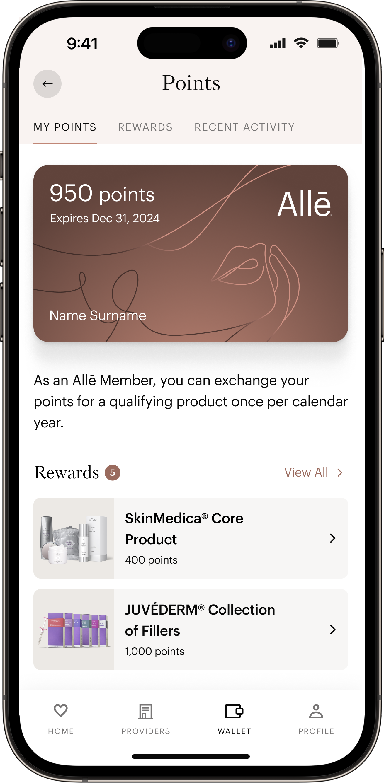
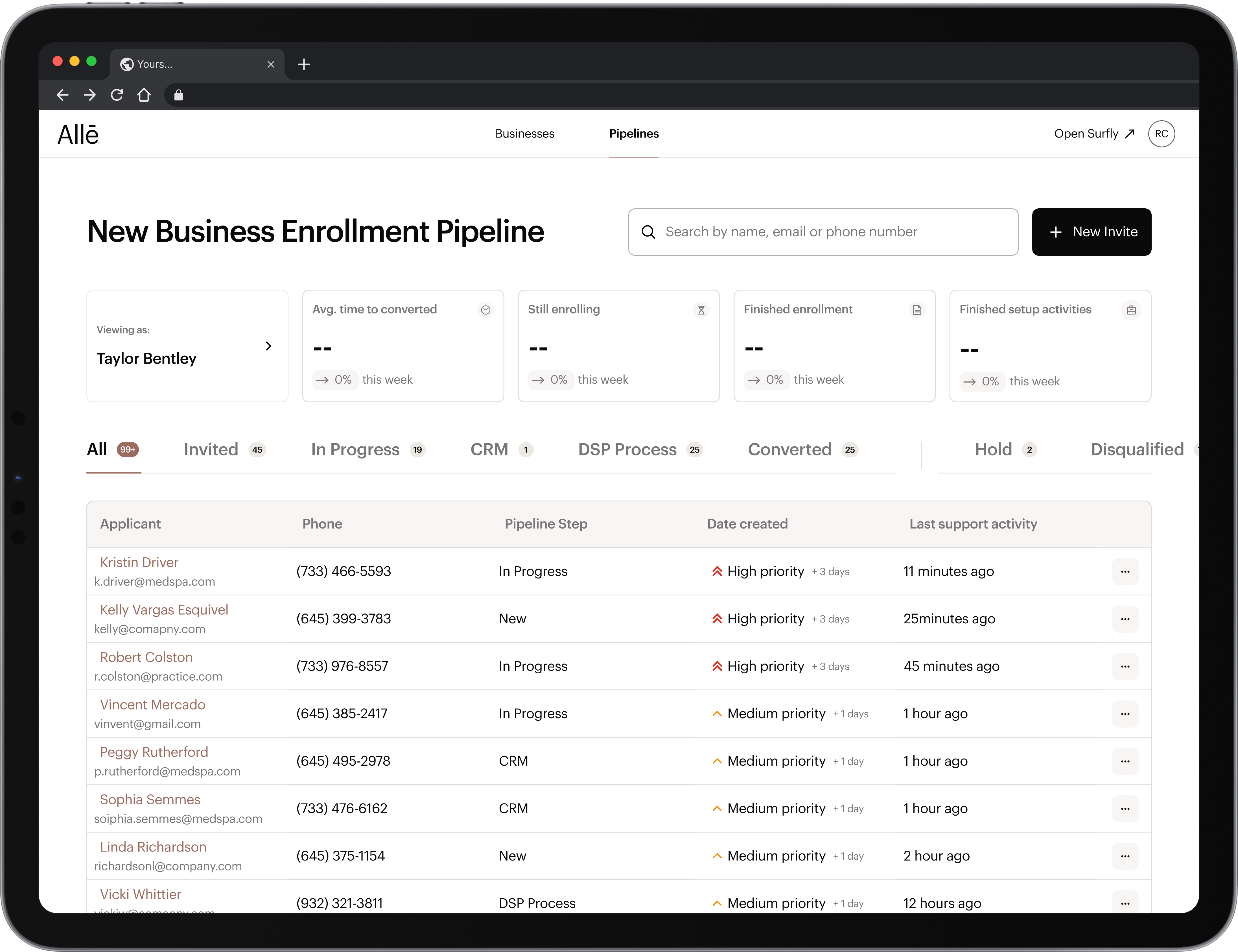
As part of A–DL at Allergan Aesthetics, our team developed the Allure Design System to unify and scale design across Allē’s key digital products—spanning internal tools, the mobile app, customer-facing web, and email. Over two years, a small team of three delivered a robust, enterprise-grade system that exceeded expectations.
The biggest challenge in building the Allē Design System was unifying a diverse set of digital products—ranging from internal admin tools to business-facing platforms—under a single, scalable system, all with a lean three-person team. We had to balance speed with precision, developing a robust foundation that served both designers and engineers while ensuring adoption across multiple teams. This meant integrating advanced Figma features, streamlining design-to-dev handoff with tools like Storybook and JIRA, and driving organization-wide trust through consistent governance, training, and support—all while future-proofing the system for evolving needs.
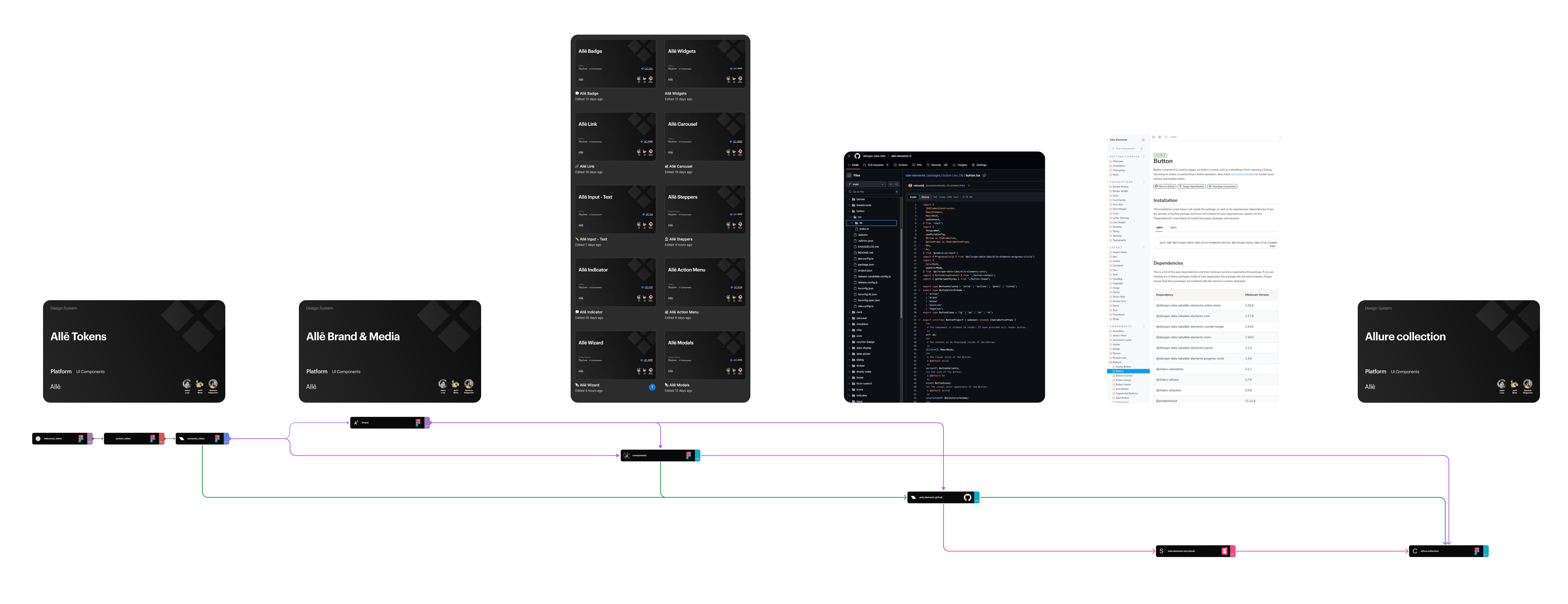
The scope of the Allē Design System encompassed the full suite of Allergan Aesthetics’ digital products, including the business solutions SaaS platform (Allē), internal admin tools (Allē for Employees), the Allē mobile app, customer-facing websites, and the email ecosystem. It covered both design and development workflows—delivering a centralized, scalable component library in Figma, a developer-accessible code base via Storybook, and a fully documented reference site. The system was built to support theming, advanced UI patterns, accessibility standards, and cross-functional collaboration, ultimately serving as the single source of truth for design across the organization.
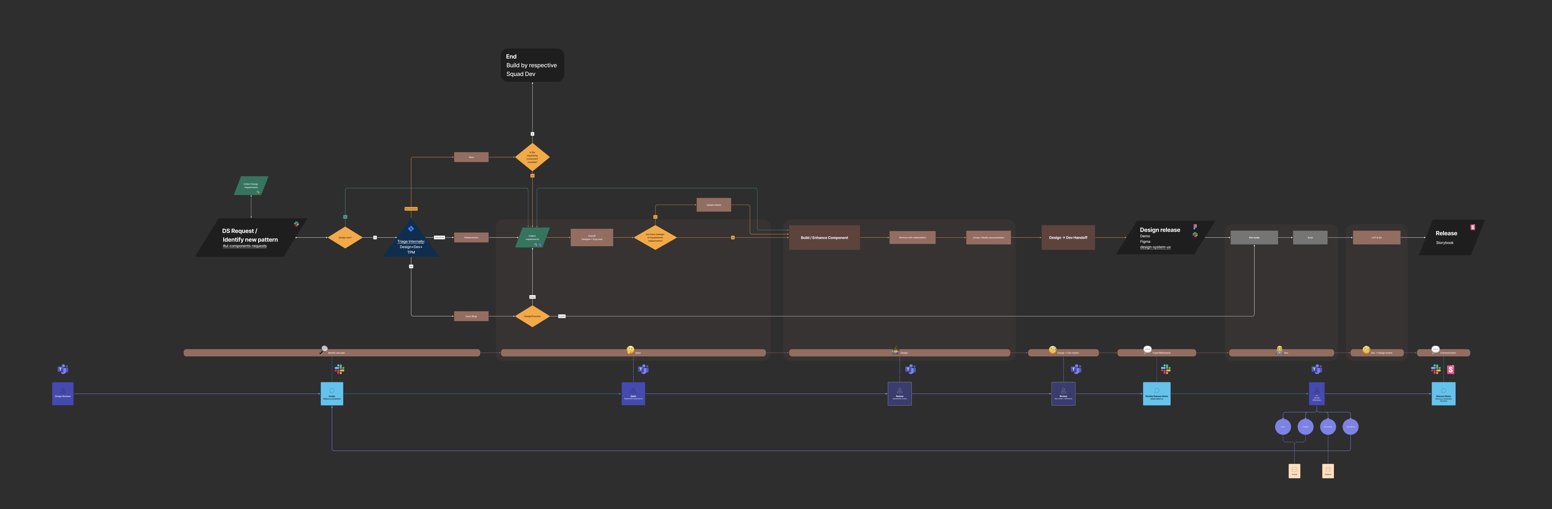
Just like the design system itself, the workflow evolved to reflect how teams actually work. This diagram illustrates how requests are processed and highlights the communication channels that keep stakeholders and cross-functional teams aligned throughout the process.
Ambiguity in ownership
• Clarified who does what, when — from design triage to development handoff and release.
Fragmented component delivery
• Ensured new patterns and components were validated, consistent, and reusable.
• prevented one-off solutions or duplicate components from creeping in.
Bottlenecks and rework
• Added checkpoints for feedback and alignment early (like triage, stakeholder review).
• Caught mismatches or misaligned expectations before design or dev went too far.
Endless Slack Threads or Missed Context
• Established clear communication channels (e.g. Jira, Slack, Figma) for updates, visibility, and approvals.
• Kept everyone on the same page with a shared source of truth.
Inconsistent or Ad Hoc Prioritization
• Aligned requests with product and design priorities via triage and prioritization stages.
• Helped the design system team focus on high-impact work, not just ad hoc tasks.
Gaps in Adoption
• Ensured new patterns go through proper documentation and release steps.
• Built confidence and encouraged adoption across teams.
From request to release, communication held everything together. It wasn’t just about keeping people informed—it was about creating shared understanding. Engineers, designers, and stakeholders often entered with different priorities, and alignment didn’t happen by accident. We set up systems for feedback to surface early, for decisions to be documented, and for handoff to feel more like a continuation than a jump. This helped prevent casual conversations from being lost, moved work into structured tracking, and ensured that visual exploration stayed grounded in technical feasibility. It created a rhythm, where ideas could evolve without losing clarity along the way.
With three products and multiple brands to support, I knew the design system couldn’t be rigid from the start. It needed to flex with the work, but also grow more structured as it matured. That balance, adaptable yet grounded, made a strong token foundation not just helpful, but essential.
Design tokens are distilled decisions. Not just values, but expressions of intent: how something should feel, how much space something needs to breathe. They carry meaning across surfaces and screens, allowing a single choice to quietly shape an entire system without the need to restate it each time. With Figma’s release of variables, which are token-like values embedded directly in the design tool, the bridge between design and implementation became even tighter. Tokens define the system’s source of truth, while variables brought that truth closer to where designers work, making tokens more visible, more actionable, and ultimately more powerful.
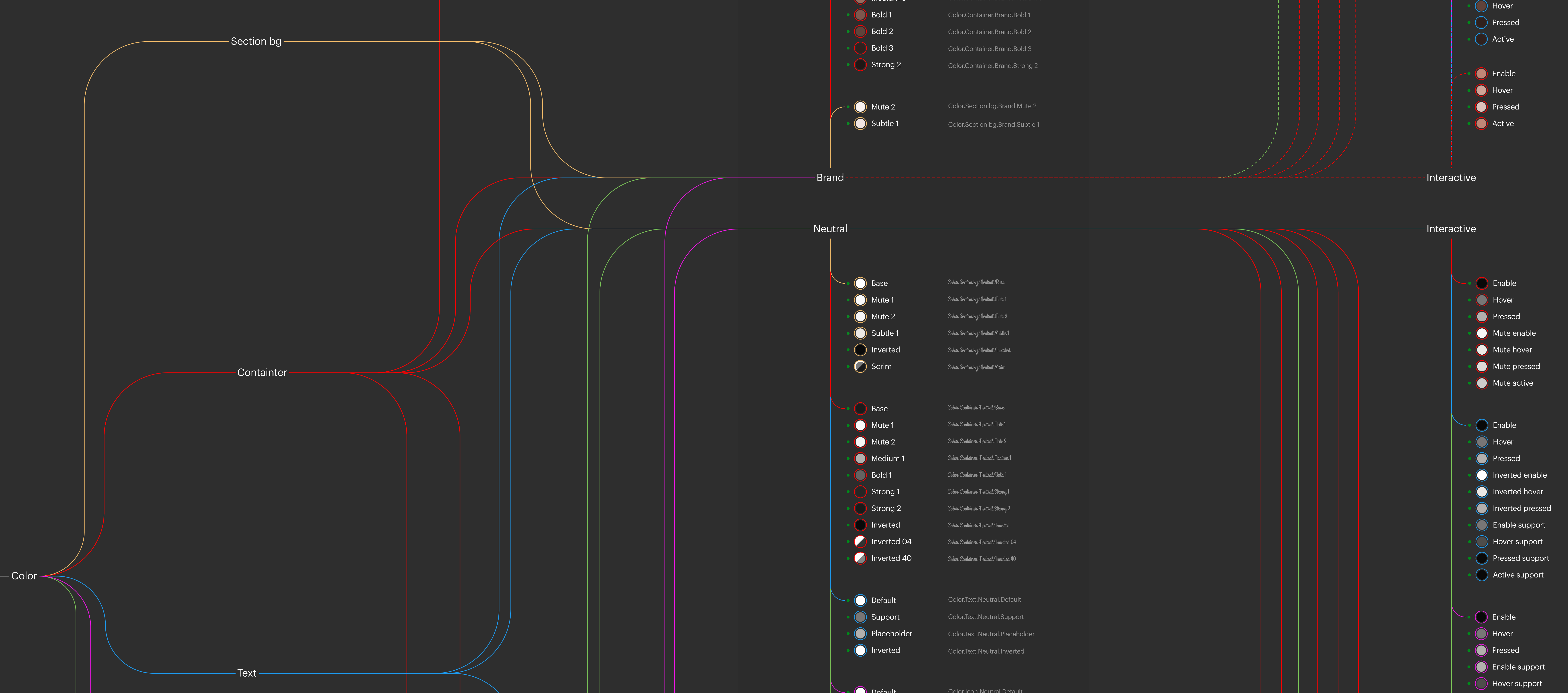
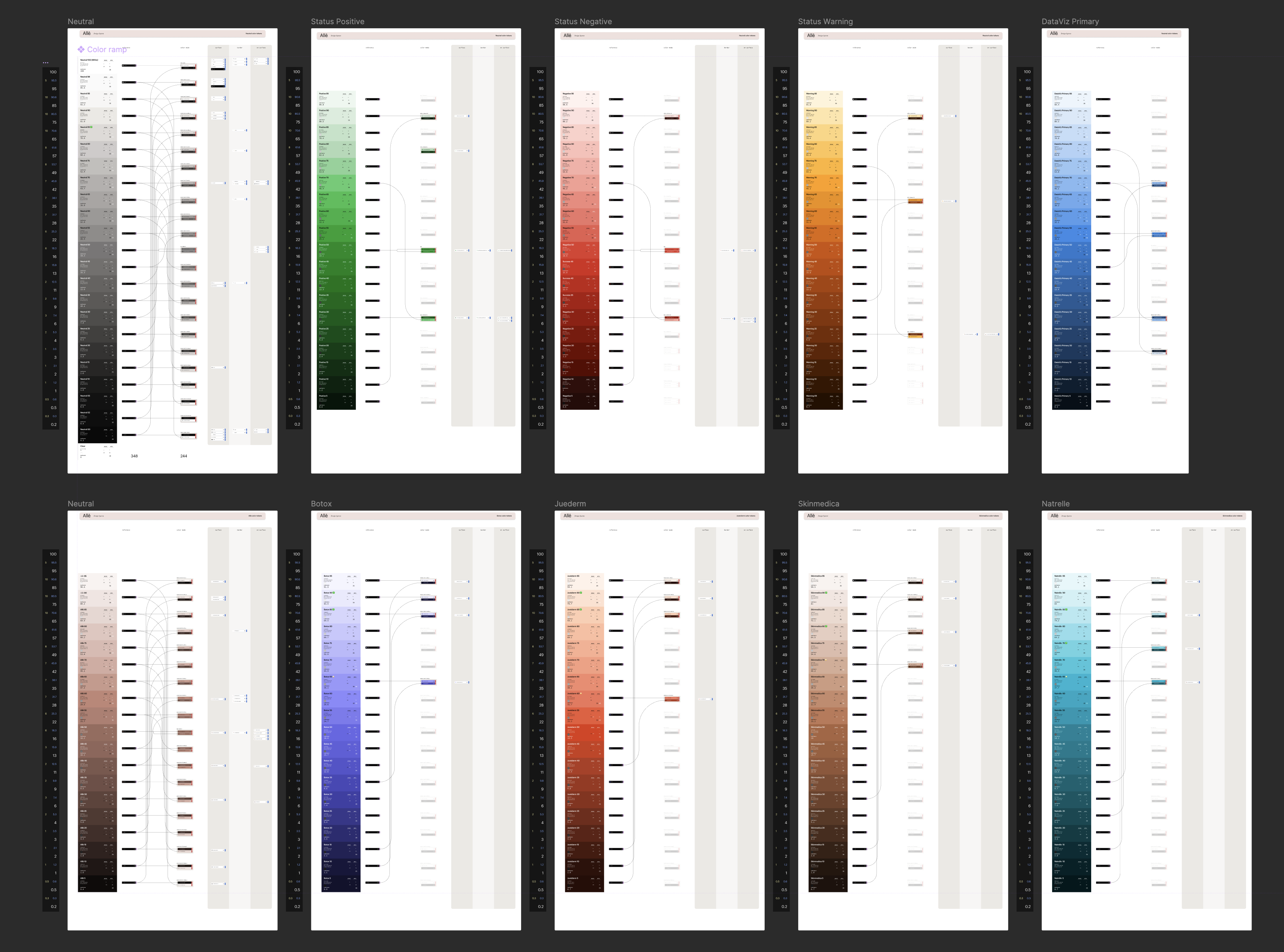
I used relative luminance to calibrate the color scales across Allergan’s brands. Not just to organize values, but to create a kind of quiet consistency: how light feels, not just how it looks. It gave each brand its own personality while still speaking a shared visual language. Designing with this standard meant one design could shift effortlessly between brand modes without losing its clarity or rhythm. The result was less about control and more about coherence.
We worked closely with engineers from the start, treating components as shared objects rather than handoffs. Every variant, every constraint, every edge case was mapped intentionally so what designers used in Figma mirrored exactly what developers shipped.
The library grew to over 70+ components, each shaped to balance consistency with flexibility. Centralizing them into a single source of truth reduced friction between design and engineering, creating a clearer path from intention to implementation. Properties were named with care, mirroring engineering where it made sense, but always designed to feel intuitive.
We went through multiple iterations of component documentation, searching for the right balance. Too much detail, and it slows everything down. Too little, and it leaves people guessing. In the end, we focused on the people who would actually use it. For designers, we wrote with clarity and context in mind, so that using a component felt intuitive rather than instructional. For engineers, we surfaced every necessary detail, removing ambiguity and reducing the space between design and implementation. The goal was never just to document, but to make good decisions easier to find and harder to get wrong.
A design system isn’t a project. It’s infrastructure. Quiet, essential, and easy to overlook when it’s doing its job well. It’s the groundwork that supports how teams build, shaping everything from how fast we ship to how consistent things feel across the product. It’s not something you finish. It’s something you maintain. And when it’s treated as a strategic layer, not just a set of files, it unlocks more than efficiency. It creates space for better decisions, better experiences, and better ways of working.
A design system is made of systems. Tokens define the language. Components bring that language to life. But adoption depends on more than what’s built. It’s shaped by how the system is shared, supported, and understood. Communication, education, and planning create the conditions for trust. When these layers align, the system works with the grain of the organization, not against it. It becomes a quiet enabler of better decisions.
Measuring adoption didn’t exist, and honestly, it still doesn’t. Not in any way that truly captures what matters. You can track usage, sure. You can count how many times a button shows up. But that doesn’t tell you if the experience is better. It doesn’t tell you if people actually want to use the system.
We never equated using the “right” component with better UX. At best, it meant faster implementation. But speed isn’t the same as care. What we cared about was the end user, along with the people building for them.
Our goal wasn’t just consistency. It was desire. We wanted to build a system people chose to use. One that felt like a partner, not a checklist.
To get there, we didn’t just ship components. We made space for connection. Weekly jam sessions to work through real UX problems with product designers. Monthly demos to share new work and gather feedback. And a library of guides to meet people where they were, onboarding materials, how-tos, component decision trees, and pattern books to support thoughtful choices.
The system became more than a library. It became a shared language. One shaped not just by usage, but by the sentiment surrounding it.
Adoption isn’t something we could quantify with perfect precision, but it didn’t stop us from paying close attention. Through countless file reviews, feedback sessions, and qualitative insights, I was able to observe patterns—where the system was working, where it was being bent, and where it was being bypassed. These signals became our compass. We leaned into the friction, asked better questions, and refined the system based on real usage, not just ideal use. Over time, adoption grew steadily. By the end, I estimate we reached around 80% adoption across teams, which was the goal from day one.
Toward the end of my time, I built a UI kit to make the system more approachable for designers. Our components already lived in individual files, which kept things clean on the backend and preserved the 1:1 alignment with code. But for designers, it created friction. Finding the right component meant digging. The kit pulled everything into one place. It made search easier, but also surfaced components people didn’t know existed. I added templatized versions of common patterns, which lifted efficiency even more. And maybe most importantly, the kit invited contribution. It gave designers a clearer entry point into the system, not just as users, but as collaborators.
In pharma, accessibility isn’t a nice-to-have. It’s required. Every component in the system had to meet strict standards before passing through MLRC (Medical, Legal, Regulatory, and Compliance) review. That meant accessibility wasn’t something we added later. It was part of the foundation. From keyboard support to screen reader behavior, we designed with inclusion in mind from the start. It made the system stronger, more trusted, and ready for real-world use.
The level of scrutiny shaped more than just the components. It shaped how the team worked. Every detail was considered, tested, and documented before anything shipped. Design, engineering, and QA operated in tight alignment, not out of obligation, but because the bar was set high and shared by all. That consistency built trust. Designers didn’t have to wonder if a component would hold up—they knew it would. The system became something they could rely on.