
ODK Media
Project Chili: The new old TV experience.
Responsibilities
- Build and manage a design team
- Create product strategies aligned with business and operations
- Explore new opportunity areas the company can expand into
- Create coherence between products and teams

Overview
ODK media is a foreign content streaming service that started with Korean content that has been operating for 10 years. For 10 years the product had minimal feature updates but the experience was never updated. The goal of Project Chili was to create a unified and connected experience between devices and services.
The challenge
To the highly business and revenue-driven company, the design function was more of an afterthought and transactional. To bring the experience not just up to date but forward-facing I had to rebuild the design team, workflow and the foundation to unify all products.
Scope
Redesigning ODK media involved many moving parts. It can be broken down into three main areas: Front end client (the products), back-end platform, and visual design. Furthermore, the product can be broken down by device: Web, apps (Mobile and Tablet), and TV(CTV and STB). Also, there were four services to cover which meant the company was foreseeing 20 products to maintain.
The service with the most products, OnDemand Korea, developed each product at different periods without any coherence. Before ODK media planned to cover more product areas for other services the need for unification and a common language backbone was crucial.


Analysis
Due to a near-monopoly market share in Korean content, some features of Ondemand Korea developed into its trademark experience. While preserving any beneficial experiences we interviewed users to validate our assumptions.
Roles
UX designer: Judy Wang, Lillian Choi

Testing methods
In addition to traditional research methods, we tried out unconventional platforms like Clubhouse for qualitative research. Especially on Clubhouse, because the audiences were interested in the topic of the room in the first place and its voluntary nature, the provided insights had an additional layer of authenticity.
User testing
We identified user pain points, needs, navigation efficiency, experience satisfaction and how users discovered contents.

Interviews including Clubhouse
Inviting people from different departments other than the design and research departments to these interviews can be crucial in showing them what UX designers and researchers do and how much impact their work has on the business’s success.
- Lillian Choi

Research & Competitor Analysis
There was a clear pain point and a trend in the industry. The nostalgic aimless browsing TV experience was gaining traction. In other words, people were getting frustrated with the ocean of choices when they expected to wind down or just enjoy watching something.


The current product findings
- The browsing section (category page) is quite large but unorganized. A major pain point is simply navigating through it, remembering things, and re-finding content.
- Search keywords in all languages (CN/KR/EN) have obvious defects that users have to input exact characters and order to find the content.
- In general, browsing the popular and top content is the No.1 action (26.1%) when users land on the home page. Higher than search specific titles(21.7%), recommendation (17.4%)and category browsing(17.4%).
- Using highly relevant recommendations at the right time may decrease users' churn (keep users watching) rather than just showing recommendations on the home page. (36.7% users would watch relevant content if no results found)
- Besides the common filtering (genres/regions), users' filtering demand is diversified because of their region's culture/habits (e.g.release year/production company).
- Content quality (28.6%) and ads (23.8%) are the main reasons to subscribe while free trial (54.5%) and price promotion (36.4%) are usually the payment trigger point.
- Users prefer the mockup with bigger fonts as it's easier and cleaner when browsing. Hover effect needs to be more careful as it may distract users when browsing.
Data/Backend flow
With this project simultaneously, the backend platform had to evolve and scale. Understanding the backend development process gave me insight into limitations and opportunities.
Main mission of the ODX Project is implementation of an Integrated BackEnd Model
ODX objects has its own model exist in asynchronous manner, with direction to assemble data by creating relation with each other.


UX focus
- Personalization: Recommendations, content order etc
- Continuous and laid back watching experience
- Logical and organized navigation system
- Efficient search and filtering

User flow and features
The new structure had user data flow in mind from the beginning. By visualizing the flow of data we were able to strategically place personalized features. Also for each feature testing models were designed simultaneously.


Exploration
V1
- No limit concept exploration
- Setting our north star

V2
- Revision of V1 concepts after testing
- Plausible concepts for company capabilities
- Aimed as a 2 year state


V3
- Aligned with Backend APIs and PMs
- Wires ready for UI
- Ready for development

Personalization
Personalizing the experience isn't a single feature attribute. Also, we wanted to avoid making it feel like content advertisements. By placing recommendations strategically, users can watch their next content effortlessly.


Laid back watching experience
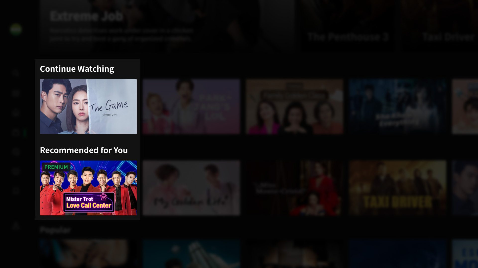
The most frustrating users encounter in the modern VOD world is selection anxiety. Recommendations are one way to filter undesirable content, still, the users are exposed to hundreds of choices per experience. We looked back at the old television experience. People still had to make a channel decision but at any moment something was playing and at best, that provoked curiosity and kept people watching an unexpected discovery. We wanted to bring this experience back to our TVs and created "Instant Watch". The moment the user launches the app it played a content that the algorithm thinks the user would be interested in. Also, we embedded linear channels with the VOD experience.


Navigation
Heat maps show that users are interacting with certain menus. So instead of exposing all content categories we minimized the top-level menu numbers and placed all other categories in a dropdown. This not only cleaned up the interface but also created space for a prime advertisement location for the web app.


Sponsored advertisement section
As an AVOD and SVOD service, ODK makes the majority through advertisement spots. A downside of CTV apps is that advertisements are limited to video ads currently. I wanted to make the ad experience much more delightful and add value to the user experience. This ad section is a unique solution to incorporate sponsored ads. While generating revenue but also serves as a unique curation section for the users.

UI
The goal of the interface design was to reflect the brand language; Simple and bold, distinct yet friendly, diverse but familiar. Though we were on a mission to design the product from scratch, there had to be elements that were inherited because there were over 2 million users that were used to the old interface.
Roles
UI design: Eunah Yoo, Hyemi Song, Yulim Moon, Yeongbin Park
Design consistency
To create a unified experience, maintaining the same design language is critical. We used a hybrid design system structure where only foundations are shared but patterns have their attributes per platform.

Font
As a multicultural service, we were using different fonts for each language. This made some of our products significantly heavy and required more development costs. Based on a multi-language font Noto Sans we identified essential characters and created an optimized single font file for 4 languages. The font file size was reduced by 80%.
Lead designer

CTV
The connected TV app was the first product to be developed using Chili. It was the missing product to cover all devices. Between all devices, CTV apps interactions are limited arrow keys, back button, and the enter button on a remote controller.
Main banners
To ODK media the main banners are the main source of content advertisement and direct a heavy amount of traffic.
To reduce operation costs the banners are the same ratio as the content posters, landscape, and portrait.

Popular and Ad space
To emphasize popular content we used vertical posters.
Followed by a sponsored advertisement space. The background can be static or motion graphics.

Curated carousels
Depending on the user data various curation carousels are placed here.

Visual design
For OTT services content posters are probably the most important element. It's the very first thing that the users see and the first thing users use to determine a choice when exploring. Also, poster design on an OTT platform is extremely challenging because each poster has its brand and character and they compete with each other.
Roles
Visual design: Minjoon Kim, Aehyun Shin, Yewon Shin, Roro Chen, Karla Chen, Andie Ortis
AB testing posters
Posters are what people use to determine their decisions. And having insight into how users react to the design was a critical function that the company was lacking. Without AB testing capabilities built on the backend, I utilized Google Optimize, Google AdSense, or manual switching to generate the data.

Original content
In 2021 ODK media began to create original content. Most of them were pilots but I had the opportunity to be involved in art directing.
Against the Odds
A documentary program that provides an opportunity for self-growth and inspiration for the future generation of Korean-American entrepreneurs on their pursuit of finding the American Dream.
Lead designer

Music post box
A special online concert for Korean Americans to celebrate the Korean Moon Festival holiday, Chuseok. Three popular Korean singers will share user-submitted stories as well as perform live on stage.
Lead designer

Growth fueled quality
Of countless things, a manager can do to keep a design team running smoothly, opportunities for personal growth were most needed in this group. I think people often do their best work when they are on a growth path. Growth motivates and challenges not only themselves but also others. And when this is supported with clear direction and empowerment, the team becomes inspiring.